A Guide to the Different Types of Web Charts
There are many reasons why you should track your business data on charts. First and foremost, it allows you to see your business in a visual way, which can be extremely helpful in identifying trends and patterns. Additionally, tracking your data on charts can help you to make better business decisions, as you’ll be able to see how changes in various metrics impact your overall business performance. Overall, tracking your business data on charts can help you to make better long-term business plans, as you’ll be able to see how your business is performing over time and identify areas for improvement.
Web charts are a vital part asset for your company. There are plenty of different types of web charts for you to explore that can offer great benefits. Explore a few different options for your beneficial web charts.
Defining Web Charts
There is no precise definition of web charts, but in general, it is a graphical representation of data that is displayed on a web page. The data can be displayed as a table, list, or grid, but a web chart usually takes the form of a diagram, chart, or map.
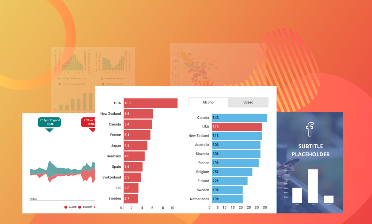
There are many different types of web charts, and the best one to use depends on the data and the desired outcome. Some of the most common types of web charts are pie charts, bar charts, line charts, and scatter charts.
Pie Charts
There are many different types of web charts, but pie charts are one of the most common. Pie charts are used to display data as a percentage of a whole. They are easy to understand and can be used to compare different data sets.
There are several different types of pie charts, including 3D pie charts and exploded pie charts. 3D pie charts are used to create a more visual representation of data. They can be used to compare data sets that are on different scales. Exploded pie charts are used to emphasize a particular data point. They are created by separating the data into segments and then moving them away from the center of the pie chart.
Bar Charts
There are many different types of web charts, but the most common are bar charts. Bar charts are simple and easy to understand, making them a popular choice for data visualization.
A bar chart displays data as a series of bars, with each bar representing a different category or value. The height of the bar indicates the value for that category.
Bar charts are a great choice for comparing values, as they make it easy to see which category is largest and which is smallest. They can also be used to track changes over time.
There are many different types of bar charts, each with its own advantages and disadvantages. Vertical bar charts are the most common and are best used for comparing values, as they make it easy to see which category is largest and which is smallest. Horizontal bar charts are best used for displaying data over time. They can be used to track changes in values over time or to compare values at different points in time.
Line Charts
Line charts are a graphical representation of data that is displayed as a series of data points connected by straight lines. These graphs are used to track the changes in data over time and to identify trends. The y-axis of a line chart typically represents the value of the data points, while the x-axis represents time.
Scatter Charts
Scatter charts, also known as scatter plots, are graphs that show the relationship between two variables. The variables are typically represented by points on the graph, and the lines connecting the points show the strength of the relationship.
Scatter plots are often used to find relationships between different factors, such as the amount of rainfall and the number of crops that grow. They can also be used to find patterns in data, such as the trend of a stock price over time.


Post Comment
You must be logged in to post a comment.